Animation
简单语法
animation-delay: 延迟第一次执行动画的时间, 可s/ms
animation-direction: 动画顺序 normal|reverse|alternate(先顺序 然后反序)|alternate-reverse(先反序 后顺序), 可组合,分隔
animation-duration: 动画持续时间
animation-fill-mode: 动画执行之前和之后的样式选择哪一帧 none|forwards(最后一帧)|backwards(第一帧)|both
animation-iteration-count: 执行次数 Integer|infinite
animation-name: 执行哪一些动画
animation-play-state: 动画是否执行 running|paused
animation-timing-function: ease|ease-in|ease-out|ease-in-out|linear|step-start|step-end|steps(4, end)
tips:
- 最后一帧和第一帧是哪一帧取决于: animation-direction和 animation-iteration-count
- animation-play-state: 如一开始就是paused, 则维持第一帧的样式, 而非默认样式
- animation里animation-duration和animation-name是必须的
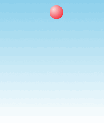
DEMO1: 回单效果
现在要做的是小球做自由落体运动的效果
体验地址: http://demo.404mzk.com/css/animation/index.html
最终效果
可以分为两部分
球向下运动是 加速运动 可以运用 ease-in
而球向上是 减速运动 可以运用 ease-out
首先大致的样式为
@keyframes bounce {
    60%, 80%, to {
        transform: translateY(400px);
        animation-timing-function: ease-out;
    }
    70% { transform: translateY(300px); }
    90% { transform: translateY(360px); }
}

.ball {
    width: 0; height: 0; padding: 1.5em;
    border-radius: 50%;
    margin: auto;
    background: red radial-gradient(at 30% 30%, #fdd, red);
    animation: bounce 10s ease-in forwards;
}
分隔为就是
0~60%: 默认的加速ease-in, 下降
60%~70%: 覆盖默认的 ease-out, 上升
70%~80%: 默认的ease-in, 下降
80%~90%:覆盖默认的ease-out, 上升
90%~100%: 默认的ease-in, 下降
而forwards则取最后一帧的样式
DEMO2: 逐帧动画
效果图:
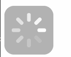
在线demo: http://demo.404mzk.com/css/animation/index.html#demo_2
如果想要做一个loading的动画
会考虑用css写还是gif还是js实现
先说说gif的弊端
- GIF图片的颜色数量被限制在256色
- GIF不具备Alpha透明的特定, 这对于不确定GIF动画的下层是什么的时候, 会是一个大问题, 更别说有半透明效果的需求
- 无法再CSS层修改GIF的持续时间, 循环次数, 是否停止等
这个逐帧动画 并不是平滑的, 而是每隔一段时间 立马换一个效果的
所以先准备大概8张的加载中的图片放在精灵图里

@keyframes loader {
    to { background-position: -800px 0; }
}

.demo_div_2 {
    width: 100px; height: 100px;
    text-indent: 999px; overflow: hidden; /* Hide text */
    background: url(../images/loader.png) 0 0;
    animation: loader 1s infinite steps(8);
}
DEMO 3: 闪烁动画
实现效果 文字闪烁
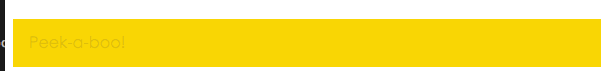
在线地址: http://demo.404mzk.com/css/animation/index.html#demo_3
文字闪烁分为两个阶段
- 文字透明度0->文字透明度1
- 文字透明度1->文字透明度0
@keyframes blink-2 {
    to {
        color: transparent
    }
}
.blink-smooth-2 {
    animation: .5s blink-2 6;
    animation-direction: alternate;
}
DEMO 4: 打字动画
要实现的是 挨个字母的出现顺序
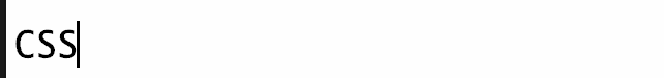
在线地址: http://demo.404mzk.com/css/animation/index.html#demo_4
@keyframes typing {
    from { width: 0 }
}

@keyframes caret {
    50% { border-right-color: transparent; }
}

.demo_div_4 h1 {
    font: bold 200% Consolas, Monaco, monospace;
    /*width: 8.25em;*/
    width: 15ch;
    white-space: nowrap;
    overflow: hidden;
    border-right: .05em solid;
    animation: typing 8s steps(15),
                caret 1s steps(1) infinite;
}