Transition
简述
定义一个元素, 切换样式时, 的变化方式
强调的是两个关键帧的Animation
简单语法
transition-delay: 默认0, 切换动画延迟时间(可负数)
transition-duration: 默认0, 切换动画的持续时间
transition-property: 默认all, 起动画作用的样式(设置多个属性时, 逗号分隔)
    例如  background
         color
         margin-left等, 也可以为class
transition-timing-function: 默认ease, 动画的执行速度
    例如 ease 开始慢,后面会快
        ease-in, 开始慢, 后面加速
        ease-out, 开始快, 后面减速
        ease-in-out, 先慢, 中快, 后慢
        linear, 平滑
        step-start, 开始就到最终效果
        step-end, 最后才立马执行效果
        steps(4, end), 分几步(正整数)到end状态
混合写法
/* Apply to 1 property */
/* property name | duration */
transition: margin-right 4s;

/* property name | duration | delay */
transition: margin-right 4s 1s;

/* property name | duration | timing function */
transition: margin-right 4s ease-in-out;

/* property name | duration | timing function | delay */
transition: margin-right 4s ease-in-out 1s;

/* Apply to 2 properties */
transition: margin-right 4s, color 1s;

/* Apply to all changed properties */
transition: all 0.5s ease-out;

/* Global values */
transition: inherit;
transition: initial;
transition: unset;
注意事项
- transition只对block级元素生效
- img标签的width,动画无效, 用scale
- 可能会发现height:0 或其他值到height:auto的过渡不会生效, 这是因为auto是一个关键字, 无法解析为一个可动画的值, 这种情况可以改max-height进行过渡, 饼干这个属性指定一个足够大的值作文展示状态
自定义调速
transition-timing-function中定义了几个常用的调速变量
但实际上我们可以自定义
cubic-bezier(x1, y1, x2, y2)
x1,y1 和x2,y2是贝塞尔曲线的两个瞄点
例如最常用的变量的cubic-bezier值为
linear: cubic-bezier(0.0, 0.0, 1.0, 1.0)
ease: cubic-bezier(0.25, 0.1, 0.25, 1.0)
ease-in: cubic-bezier(0.42, 0.0, 1.0, 1.0)
ease-in-out: cubic-bezier(0.42, 0.0, 0.58, 1.0)
ease-out: cubic-bezier(0.0, 0.0, 0.58, 1.0)
step-start: 等同于steps(1, start)
step-end: 等同于steps(1, end)
自定义曲线点网址是: http://cubic-bezier.com/
例如ease的贝塞尔曲线:
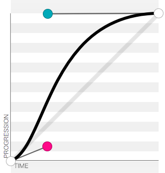
这里的y轴代表动画完成进度可以大于1, 例如当scale为(1,1), 而想在中途有个放大大于1倍的而最后又回到倍数1的效果.
x轴无法大于1, 因为我们木有时光机
任务1: 图片切换
在线体验: http://demo.404mzk.com/css/transition/index.html
切换效果如下
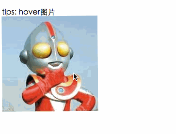
简单分析一下
切换时
- 前一张图片旋转至0度 并缩放至0倍
- 后一张图片旋转至360度 并缩放到1倍
.demo_1{
    width: 200px;
    position: relative;
}
.demo_1 .img_1{
    position: absolute; ;
    transition-duration: 1s;
    transform: rotate(0deg) scale(1,1);
}
.demo_1 .img_2{
    transition-duration: 1s;
     position: absolute; ;
    transform: rotate(0deg) scale(0,0);
}

.demo_1:hover .img_1{
    transition-duration: 1s;
    transform: rotate(360deg) scale(0,0);
}
.demo_1:hover .img_2{
    transition-duration: 1s;
    transform: rotate(360deg) scale(1,1);
}
任务2: 输入框弹性提示框
效果图
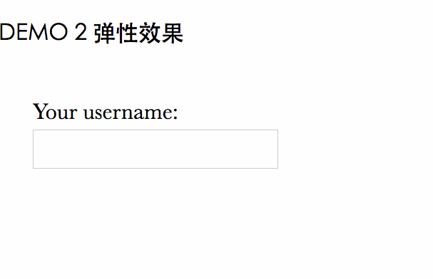
在线演示: http://demo.404mzk.com/css/transition/index.html
input:not(:focus) + .callout:not(:hover) {
    transform: scale(0);
    transition: .25s transform;
}

.callout {
    transition: .5s cubic-bezier(.25,.1,.3,1.5) transform;
    transform-origin: 1.4em -.4em;
}
任务3 浏览器tab
https://www.zhangxinxu.com/study/201206/css3-transform-matrix-skew.html
https://www.cnblogs.com/huansky/p/6077166.html
https://cssreference.io/property/transform/